GoodReads.
Making books more discoverable
My Role
Product Designer
Duration
3 months
My Team
Myself

CONTEXT
What is GoodReads?
Goodreads is the world’s largest site for readers and book recommendations. The main functionalities of (as mentioned on the site) are –
-
See what books your friends are reading.
-
Track the books you're reading, have read, and want to read.
-
Check out your personalized book recommendations.
-
Find out if a book is a good fit for you from community reviews.
PROBLEM
Out of 90 million users, only 50 million users are active which is about 55% of the total registered users.
Despite its popularity, the UI is old and clunky as it has not been updated for almost 10 years.
THE CHALLENGE
How might we redesign Goodreads to -
Get new users (Acquisition)
Enhance user’s experience (Customer Delight)
Encourage users to use the website more frequently (Customer retention)
RESEARCH
A Design Audit was conducted to identify pain points of current website
This yielded 5 critical insights on which I based my final redesigns around.
INSIGHT #1
Crowded Content
Visual overload overwhelms users which makes it hard for them to pay attention to any element shown on the page.
INSIGHT #2
Infinite Scrolling
The user doesn’t know when the webpage is going to end. They also have to scroll all the way up.


INSIGHT #3
Lack of feedback during navigation
No pages are highlighted or breadcrumbs are present to indicate which page the user is on.
INSIGHT #4
Lack of personalization of recommendations
Irrelevent genres listed at the top of the webpage under ‘Featured lists’.


INSIGHT #5
Lack of flexibility in rating
No avenue is provided for a half-star rating. Therefore, users usually end up giving a higher or lower rating in most cases.
A SWOT Analysis was carried out to understand the business perspective

Information gathered during user research were distilled into three unique personas


BRAINSTORMING
Redoing the sitemap was the first step to improving navigation across the platform
Current Sitemap

Proposed Sitemap

-
In the proposed sitemap, related functionalities have been organized under primary pages to enhance simplicity and clarity.
-
Multiple links leading to the same page were identified and consolidated into a primary page.
-
Additionally, "Browse" page was renamed to "Explore" and key functionalities were grouped together under this category. Since the designation of "Community" as a main page was somewhat vague, I've renamed it to "Get Involved," a more self-explanatory label. Lastly, the "Account" section's flow was streamlined for a more user-friendly experience.
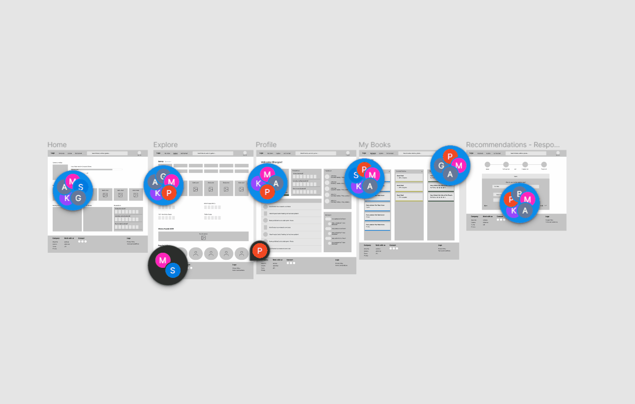
Further, I plan on focusing on redesigning frequently visited pages first - Home, My books, Explore, Recommendations and Profile.
I also received a lot of feedback and iteratively designed my wireframes multiple times
The final designs were designed keeping this feedback in mind. Collaborating with fellow designers enabled me to improve my designs.
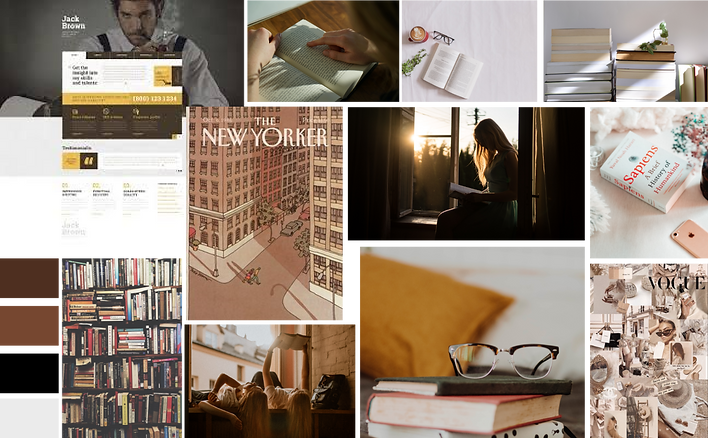
Formulated a moodboard which formed the basis of the look and feel of the upcoming redesigns
FINAL DESIGNS
My primary role when recreating the redesigns was to eliminate the problems identified during the research phase
-
I've simplified the layout of each page to create a clean and uncluttered appearance, ensuring that users don't experience information overload.
-
I've also added clear visual cues on each page to help users easily identify their current location within the website.
-
To enhance consistency, I've eliminated redundant page redirects and utilized similar sections across pages that share common content.
HOME
Current Website

Redesign

EXPLORE
Current Website


Redesign

PROFILE
Current Website

Redesign

READING LIST
Current Website

Redesign

RECOMMENDATION
Current Website

Redesign

MY LEARNINGS
Collaboration is important in producing quality design
I was able to learn a lot by sharing and recieving feedback, presenting my designs and explaining the rationale behind my design decisions.
Narrowing down the project scope was tough
My initial instinct was to redo all pages of the website based on what I had learned in class. Putting business and user needs first helped me prioritize challenges that needed solving.
Check out my other case studies

